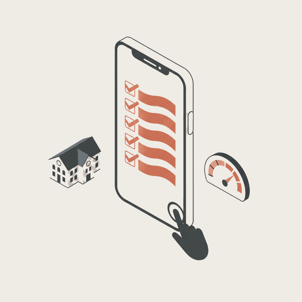
Your website converts at 0.8% — seven pages decide almost all of it
Most US higher education websites have the same structure problem: information is correct, but it is spread across dozens of pages in a way that exhausts the prospect before they ever ask a question. The result is a conversion rate of 0.8% on average — eight inquiries per thousand visitors.
Prospects visit an average of 4.7 pages before asking their first question (Source: analytics + session replay, 15,000 prospect journeys, 2025–2026 cycle). Those 4.7 pages are not random. Session data from 15,000 journeys shows that the same seven page types appear in the vast majority of journeys, in roughly the same order, every recruitment cycle.
Get those seven pages right and your conversion rate moves. Get them wrong — or leave them incomplete — and the prospect leaves for a competitor who answered the question you buried on page 14 of a viewbook PDF. For the wider context of what this generation expects when they arrive on your site, see our Gen Z expectations guide for college websites.
1. Homepage — eight seconds, one decision
The homepage is not a welcome page. For a prospective student comparing three institutions on their phone on a Sunday evening, it is a credibility test. They are not reading; they are scanning for evidence that your institution is relevant to their ambition.
The data is unambiguous: bounce rate on US higher education homepages averages 68% without an AI chatbot, falling to 41% when one is present (Source: A/B test on 22 partner college sites, Sept–Dec 2025). That 27-point gap is not produced by design alone — it is produced by the presence of an answer at the moment the question forms.
What the homepage must communicate above the fold, on mobile:
- What kind of institution you are and at what level (undergraduate, graduate, professional)
- Your city, state and campuses — out-of-state and international prospects use this to filter before reading a single line
- Your strongest differentiator, in one measurable sentence ("94% of graduates employed or in graduate school within 6 months")
- A visible way to start a conversation — chatbot, call-to-action, or campus tour registration
The homepage sets the frame. Every other page in this list either confirms or undermines what the prospect decided in those first eight seconds. Google's Core Web Vitals provide the technical floor: an LCP above 2.5 seconds costs you candidates before a single word is read. Check your score before anything else.
2. Program and major pages — the most visited page in every journey
The program page is visited by 92% of prospects before they make first contact. It carries more conversion weight than any other page on your site. And it is the page most likely to fail prospects, because it was written for a course catalog, not for a 17-year-old deciding where to spend four years and $80,000 to $320,000.
89% of prospects ask about tuition first, 84% ask about career outcomes, and 78% ask about internships and co-op opportunities (Source: analysis of 12,000 Skolbot conversations, Sept 2025–Feb 2026). Every program page must answer these three questions without requiring the prospect to navigate away.
A high-converting program page contains:
| Element | What to include |
|---|---|
| Program title and degree | Degree title (B.S./B.A./M.S./Ph.D.), level, duration, modality (on-campus, hybrid, online) |
| Admissions requirements | GPA range, SAT/ACT range or test-optional policy, AP credit policy, prerequisite courses |
| Tuition and cost of attendance | Annual tuition, room and board, total cost of attendance, link to Net Price Calculator |
| Career outcomes | First-destination employment rate, median starting salary, top employers (cite Common Data Set or NACE First-Destination Survey) |
| Experiential learning | Internships, co-ops, undergraduate research, study abroad — embedded vs. optional |
| Accreditations | Regional accreditor, programmatic accreditation (ABET, AACSB, ACBSP, CAHIIM, CCNE, etc.) |
| Apply CTA | Direct link to Common App, Coalition Application, or institution application portal |
Institutions that display tuition and a Net Price Calculator link openly see a first-contact rate 25–35% higher than those requiring prospects to "contact admissions for pricing". The Higher Education Opportunity Act of 2008 requires every Title IV institution to publish a Net Price Calculator — this is both a conversion lever and a federal compliance one.
3. Tuition and financial aid page — the page that kills or converts
The tuition and financial aid page is visited by 78% of prospects before first contact. For most, it is the decision gate: if the numbers are absent, evasive, or poorly structured, the journey ends here. Not because the prospect cannot afford your program — but because they cannot plan for it.
US-specific complexity makes this page harder to write and more important to get right. A prospective student must understand the interplay between sticker price, the federally mandated Net Price Calculator, FAFSA-based need-based aid, merit scholarships, work-study, federal student loans, and private loans.
The tuition and financial aid page must address four distinct financial audiences:
- In-state public undergraduates: in-state tuition, room and board, FAFSA-based aid, state grant programs, federal Pell eligibility
- Out-of-state and international undergraduates: full sticker price, scholarship availability, deposit requirements, I-20 and SEVIS process
- Graduate students: tuition per credit hour, graduate assistantships, federal Direct Unsubsidized and Grad PLUS loans
- Adult and transfer students: prior learning credit, employer tuition reimbursement, military benefits (Yellow Ribbon, Post-9/11 GI Bill)
Link to Federal Student Aid for FAFSA and federal loan information, and embed your Net Price Calculator prominently — not as a bottom-of-page footer link. List your scholarship and institutional aid deadlines with application links — not "visit our scholarships page" but the scholarships page, directly linked.
4. Admissions and requirements page — the filter that must not deter
The admissions page is visited by 71% of prospects before first contact. Its job is to help a candidate self-qualify — to understand whether they can apply, not to make application feel unreachable.
The most common failure: admissions requirements written as a hard list of GPA and test scores, with no contextual information. A prospect with a strong holistic profile reads "1350 SAT minimum" and assumes they cannot apply, even when your test-optional policy and holistic review process make them eligible.
US admissions pages must address:
- GPA range and weighting: middle-50% range from the most recent admitted class, weighted vs. unweighted policy, contextual evaluation of high school rigor
- Standardized testing: SAT/ACT score ranges or test-optional / test-blind policy, SAT subject test policies (where still relevant), and how the institution evaluates self-reported scores
- AP, IB and dual enrollment credit: credit-by-exam policy, course equivalencies, and how transfer credit affects program length
- Holistic review factors: extracurriculars, essays, recommendations, demonstrated interest — what counts and how
- Application platforms: Common App, Coalition Application, direct application, Cappex — which the institution uses and any preference
- Transfer admissions: minimum credits, articulation agreements with community colleges, credit transfer policy
- Deferred entry and gap year: institutional policy on gap years and deferred enrollment to the following fall
The NACAC Statement of Principles of Good Practice sets expectations for fair and transparent admissions — your admissions page is the public face of that commitment. A well-structured admissions page reduces both the volume of repetitive inquiries and the number of unsuitable applications, saving time for your admissions team.
For the institutional reporting equivalent, your Common Data Set page — the standardized institutional data set used by US News, Peterson's, College Board and most rankings publications — should be linked from the admissions page. Sophisticated prospects and counselors look for it.
5. Outcomes and graduate destinations — proof, not promotion
54% of prospects visit a student outcomes page during their journey. After they have confirmed the program is relevant and the cost is manageable, they shift to a different question: does this institution actually deliver what it promises?
Generic testimonials do not answer this question. "I had a great four years" is not evidence. What converts is verifiable, specific proof anchored in public data.
High-converting outcomes content uses three sources:
-
First-destination survey data: the NACE First-Destination Survey is the standard for US first-destination outcomes within six months of graduation. It covers employment status, occupation type, graduate-school placement, and median starting salary. Cite your results with the survey year and the percentage of graduates reporting. An employment-or-graduate-school rate of 91% with the survey reference is trustworthy; "most of our graduates succeed" is not.
-
Common Data Set retention and graduation rates: your institution's first-year retention rate and four- and six-year graduation rates from your published Common Data Set are recognized by prospects, families and counselors. Display them prominently with the cohort year.
-
Individual student stories with specifics: name, graduation year, major, current employer and role, and salary progression if they are willing to share it. A 60-second video filmed on a phone outperforms a marketing-produced paragraph every time.
For institutional-level context, IPEDS data on completion and post-graduate outcomes provides federal-grade benchmarking that strengthens your own figures.
6. Student life page — the tiebreaker in a close comparison
When two institutions are roughly equal on program, cost and admissions fit, student life decides. This page is not visited early in the journey — but it is often the last page visited before a prospect asks their first question or schedules a campus visit.
The student life page must be authentic before it is polished. 67% of prospect activity happens outside business hours (Source: Skolbot interaction logs, 200,000 sessions, Oct 2025–Feb 2026) — prospects browsing at 10pm on a Sunday are not reading institutional copy; they are looking for evidence that they will belong.
Content that converts on the student life page:
- Housing: residence hall types (traditional, suite, apartment), distance from academic buildings, cost per academic year, application process and priority deadlines for first-year students. Link to housing application directly.
- Greek life and student organizations: number of Greek-letter organizations, total number of student organizations and club sports — prospects want to know this is a real community, not a managed brand.
- Campus environment: genuine photos and short videos from current students. Campus location, transportation links, nearest city.
- Support services: counseling and mental health, accessibility and disability resource center, financial aid office hours, food security and basic-needs resources — these matter to first-generation and Pell-eligible students and their families in ways institutions frequently underestimate.
One structural recommendation: use current students as contributors to this page, not the marketing department. The authenticity signal is immediate and credible to a Gen Z reader who has developed acute sensitivity to brand-produced content.
7. Apply and contact page — the conversion point
Every page in this list builds towards one action: the prospective student deciding to take the next formal step. The apply and contact page is where that decision either crystallizes or dissolves.
The Common App Apply button should be prominent and require no scrolling to find. For graduate programs and direct-apply institutions, your direct application portal should be equally visible with clear guidance on what is required to complete the form. Friction at this stage is expensive: 42% of applicants who begin a form do not complete it.
This page should also serve as the AI chatbot entry point. 67% of prospect activity happens outside business hours — a prospect who reaches the apply page at 9pm and has a final question about test-optional policy or transfer credit cannot wait until Monday morning. An AI chatbot that answers in three seconds keeps the prospect in motion; a contact form that takes 72 hours to receive a reply does not.
The contact page should include:
- Chatbot widget: visible on every page, but especially here
- Common App link: clearly labeled with the current cycle year (e.g. "Apply for Fall 2027")
- Direct application portal link: for graduate and continuing-education programs not managed through Common App
- Admissions team contact: email and phone with realistic response time expectations
- Campus tour booking link: a significant proportion of prospects arriving on the contact page are not yet ready to apply — they want to visit first; make this easy
The privacy notice required by FERPA and applicable state privacy laws (CCPA/CPRA in California, plus parallel laws in 20+ other states) must appear before any form submission. Keep it concise and link to your full privacy notice and Title IX statement — do not bury the submission button under legal text. Your Title IX page and FERPA notice should both be linked from the footer, not just the contact page.
For a deeper analysis of how these pages work together to build the complete conversion funnel, see our articles on the ideal prospect journey to enrollment, college landing page conversion anatomy, and website conversion rate benchmarks by college type.
How the seven pages work as a system
No individual page converts in isolation. The prospect moves through them in sequence — homepage, program, tuition, admissions, outcomes, student life, apply — and each page either reinforces confidence or introduces doubt.
The following table shows the average visit rate per page and the primary conversion risk at each stage:
| Page | % of journeys that include it | Primary conversion risk if done poorly |
|---|---|---|
| Homepage | 100% | High bounce rate; prospect never reaches program page |
| Program / major | 92% | Tuition or career outcomes missing; prospect goes to competitor |
| Tuition and financial aid | 78% | Opacity breeds distrust; prospect self-disqualifies unnecessarily |
| Admissions | 71% | Hard requirements with no context; eligible prospects self-exclude |
| Outcomes | 54% | Vague claims without data; prospect cannot validate the investment |
| Student life | 54% | Stock photos and marketing copy; inauthenticity destroys trust |
| Apply / contact | Variable | Friction on form or no out-of-hours support; prospect delays and disengages |
The single highest-leverage intervention that affects all seven pages simultaneously is deploying an AI chatbot. The chatbot does not replace the content — it catches the prospect at the moment a question arises on any of these pages, at any hour, and answers it before doubt becomes disengagement.
FAQ
Which page on a college website converts most prospects?
The program or major page drives more conversions than any other single page — it appears in 92% of prospect journeys before first contact. But conversion is a system: a strong program page next to a tuition page that says "contact us for pricing" will still lose the prospect. All seven pages need to function together.
Should US colleges display tuition and a Net Price Calculator on their website?
Yes — and the Net Price Calculator is federally required for any institution participating in Title IV federal aid programs. 89% of prospects ask about cost before anything else, and institutions that display tuition openly with a prominent Net Price Calculator link report a 25–35% higher first-contact rate than those that require an inquiry. Hiding cost creates the distrust it tries to avoid, and burying the Net Price Calculator three clicks deep is functionally the same as hiding it.
How does the May 1 decision day affect which website pages need updating?
The admissions, financial aid and apply pages see significant traffic spikes in the weeks before the National Candidates Reply Date (May 1) and during the summer melt window between May and August. Both pages need to be updated before May 1 with deposit-paying instructions, financial aid acceptance procedures, and the next-step pre-arrival checklist. A chatbot configured with admitted-students FAQs is particularly valuable during this period, when admitted-student volumes spike and admissions teams are at maximum capacity.
What role does Common Data Set play on a college website?
The Common Data Set is the standardized institutional data set used by US News, Peterson's, College Board and most ranking publications. Sophisticated prospects, parents, and high-school counselors look for it. Link your most recent CDS from the institutional research, admissions and outcomes pages. It is credibility shorthand that reduces the cognitive load of comparing institutions and signals transparency.
How does an AI chatbot improve conversion across these seven pages?
The chatbot reduces bounce rate from 68% to 41% (a 27-point improvement), nearly doubles pages per session, and triples session duration. More specifically, it answers the questions that arise on each page — financial aid details on the tuition page, test-optional clarifications on the admissions page, housing queries on the student life page — in real time, outside business hours. The prospect who gets an answer stays in the journey. The one who does not, leaves.
These seven pages are not a redesign project — they are a content audit. Most institutions already have all seven. The question is whether each page answers the question the prospect arrives with, clearly enough, quickly enough, and at any hour they arrive.
Request a personalized demo