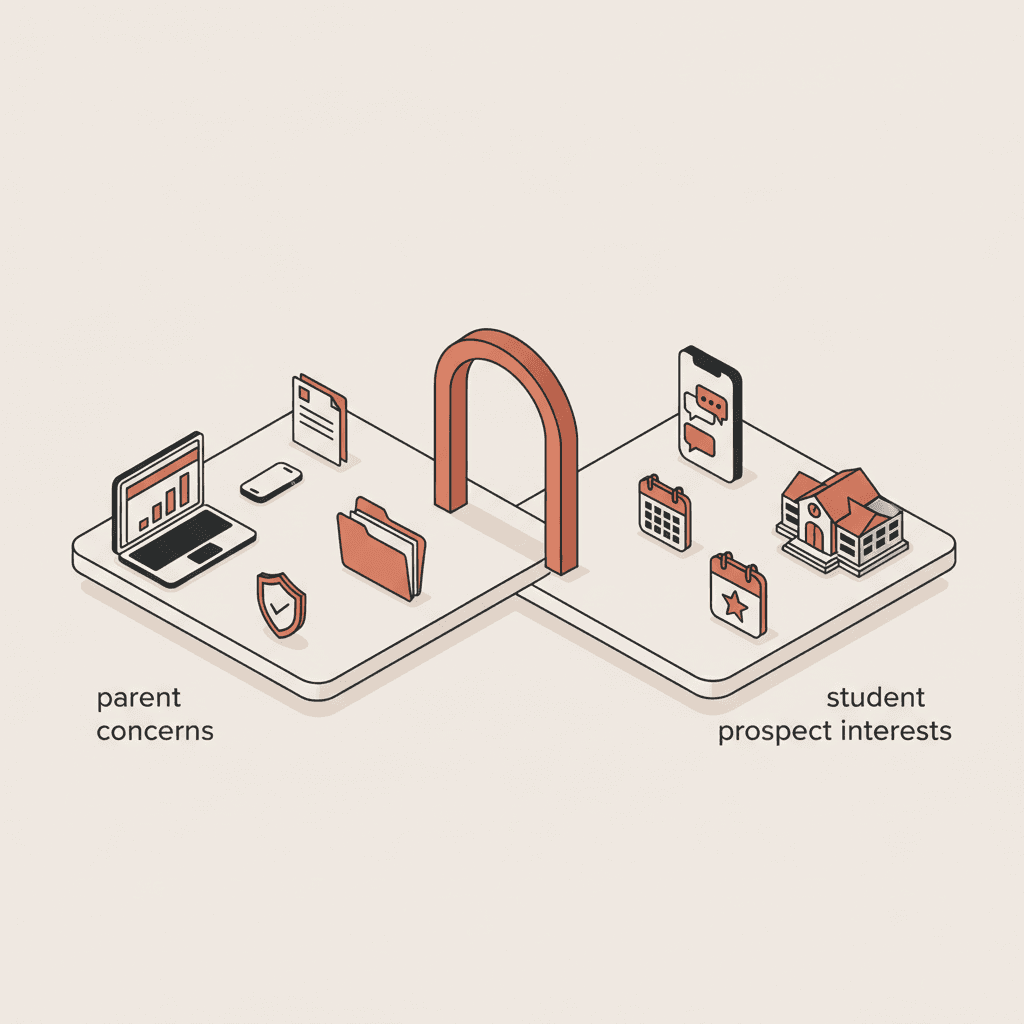
Direct answer: what a mobile-first enrollment journey requires
A mobile-first enrollment journey is a five-step flow — program landing, viewbook, pre-application, campus tour, full application — designed to work on a 375px viewport with one-handed use, Largest Contentful Paint under 2.5s, forms that save automatically and WCAG 2.2 AA conformance. In the 2025-2026 admissions cycle, the Skolbot team scored 40 US college and university websites against a 30-point checklist across six categories: performance, structure, forms, trust, conversion and accessibility. The median score was 14/30. Only four institutions exceeded 22/30.
This article gives you the checklist, the scoring methodology and the fatal patterns that sink mobile conversion — so you can grade your own site this afternoon.
Why mobile-first is not optional for US college admissions
Gen Z prospects research on phones. Common App applicant behavior data and Google's Think with Google research show that more than two-thirds of college research sessions and a clear majority of decision-day traffic now come from mobile devices. The May 1 National Decision Day window itself is a mobile-first event: admitted students compare financial aid offers, message friends and confirm enrollment from the same phone, often within a single hour.
According to Skolbot's journey analytics (15,000 prospect sessions, 2025-2026 admissions cycle), the global average is 4.7 pages visited before a prospect asks their first question. Business schools sit at 5.2, engineering at 3.9, computer science at 3.1. The most-visited pages before questioning are the program page (92%), tuition and financial aid (78%) and admissions requirements (71%). If any of those three pages fails on mobile, the prospect silently leaves without ever reaching a form.
Prospect activity hours reinforce the point. Sixty-seven percent of enrollment journey activity happens outside office hours, with a distinct Sunday 8-9pm peak. That window is mobile-dominant by definition — no desktop in an office at 8pm Sunday. A website that needs a laptop to convert is a website that loses two-thirds of its qualified traffic.
| Metric | Desktop | Mobile |
|---|---|---|
| Share of Gen Z college research traffic (US) | 28-34% | 66-72% |
| Average session depth (pages) | 3.8 | 2.4 |
| Form completion rate (full application) | 42% | 18% |
| Viewbook download conversion | 6.1% | 3.2% |
| Bounce rate when LCP > 4s | 38% | 53% |
The form-completion gap is the one that stings. Mobile traffic is where the prospects are, but desktop is where they finish — because most college application forms were built desktop-first and never reworked. The checklist below is how you close that gap.
The 30-point mobile-first enrollment UX checklist
The checklist is organized into six categories of five criteria. Each criterion is binary — pass (1 point) or fail (0). A total out of 30 gives you a comparable score you can repeat quarterly.
| Category | Criterion | Pass condition |
|---|---|---|
| Performance | LCP | Largest Contentful Paint <2.5s on 4G Moto G4 (Core Web Vitals) |
| Performance | INP | Interaction to Next Paint <200ms |
| Performance | CLS | Cumulative Layout Shift <0.1 |
| Performance | Image weight | Hero image <200KB, WebP or AVIF |
| Performance | Third-party scripts | <10 third-party blocking scripts on program page |
| Structure | One-handed reach | Primary CTA reachable with right thumb, bottom 60% of screen |
| Structure | Tap targets | Interactive elements ≥44x44px, 8px spacing |
| Structure | Sticky nav | Persistent header with program, tuition, apply links |
| Structure | Breadcrumbs | Back-one-step always visible, not browser-only |
| Structure | Hamburger depth | Menu ≤2 levels, no accordion-inside-accordion |
| Forms | Field count | Pre-application ≤5 fields, full application chunked by step |
| Forms | Input types | type="email", type="tel", inputmode="numeric" set correctly |
| Forms | Save & resume | Partial progress persisted for ≥14 days via email magic link |
| Forms | Error states | Inline, field-level, specific text (not "invalid input") |
| Forms | Autofill | autocomplete attributes on name, email, ZIP code, DOB |
| Trust | HTTPS & padlock | Valid TLS, no mixed content warnings |
| Trust | Privacy at point of capture | One-line privacy summary next to email field, link to full policy and FERPA notice |
| Trust | Alumni proof | At least one authentic alumni quote or video above the application CTA |
| Trust | Tuition transparency | Total cost of attendance and Net Price Calculator linked from tuition page without downloading a PDF |
| Trust | Contact escalation | Phone number and SMS or chat link visible on every program page |
| Conversion | Primary CTA clarity | Single dominant CTA per screen, verb-led ("Schedule campus tour", not "More info") |
| Conversion | Secondary action | Viewbook download or chatbot as secondary, never primary |
| Conversion | Micro-conversion path | Viewbook form ≤3 fields, instant email delivery |
| Conversion | Campus tour booking | Booking flow ≤3 taps, calendar add-to-phone on confirmation |
| Conversion | Mobile chat | Persistent chat or SMS widget on program and tuition pages |
| Accessibility | Contrast | 4.5:1 for body text, 3:1 for large text (WCAG 2.2) |
| Accessibility | Focus indicators | Visible keyboard focus on all interactive elements |
| Accessibility | Screen reader labels | Form fields and buttons have programmatic labels |
| Accessibility | Zoom tolerance | Layout holds at 200% text zoom without horizontal scroll |
| Accessibility | Reduced motion | prefers-reduced-motion respected on autoplay and parallax |
Institutions scoring 24/30 or above in our 2025-2026 sample recorded a median mobile application-completion rate of 31%, against 18% for the cohort as a whole — a 70% relative uplift.
Accessibility is also a legal floor in the US
For US institutions, the accessibility category of the checklist is not only a usability concern. The Americans with Disabilities Act (ADA) applies to college and university websites as places of public accommodation, and the Department of Justice has confirmed WCAG 2.1 AA as the operative technical standard in its 2024 Title II rulemaking. Public institutions that receive federal funding must also meet Section 508 requirements for digital content. Failing the five accessibility criteria above is therefore a compliance exposure, not just a UX score — and OCR complaints under the ADA against college websites have grown materially since 2020.
Fatal mistakes that kill mobile conversion
Five patterns appear over and over in low-scoring audits. Each one, on its own, can halve your mobile completion rate.
Long, unbroken forms. A single-screen Common App supplement asking for 24 fields on a 375px viewport cannot be completed one-handed in under three minutes. Baymard Institute research on mobile checkouts consistently finds that chunking a form into steps with visible progress raises completion rates 20-30%. Higher education is no different.
Hidden or PDF-only tuition information. Prospects who cannot find the total cost of a program on the tuition page within three taps leave. The Skolbot audit found 62% of US institutions require a PDF download to see the actual sticker price plus typical fees — on mobile, that means a 3MB PDF rendered inside a mobile Safari PDF viewer with no zoom, no contrast, no accessibility. The federally mandated Net Price Calculator should be one tap away on every tuition page; many colleges bury it three clicks deep.
No save-and-resume on full application. Prospects apply from phones during the Sunday 8-9pm window. They are interrupted by life — dinner, a sibling, the end of a bus ride. A form that loses state on tab switch or session timeout loses the applicant. Save-and-resume via email magic link is the single highest-ROI form improvement you can make. The Common App handles this natively; institution-specific applications and supplements often do not.
No SMS or mobile chat CTA. Think with Google mobile research shows that mobile prospects expect a messaging channel on par with email. Colleges without an SMS or in-page chat on the tuition and admissions pages push the prospect to the switchboard during office hours — a 67% mismatch against actual browsing time.
Slow LCP on the program page. NNGroup mobile UX research has documented the 3-second rule for over a decade, and Core Web Vitals codified it. A program hero image over 500KB, loaded from a CDN without WebP, is enough to push LCP past 4s on mid-range Android — the device median for first-generation and Pell-eligible applicants. Bounce at 4s+ LCP sits at 53% on mobile versus 38% on desktop.
Scoring methodology: how to score your own site 0-30
Pick a weekday evening, a 4G connection and the most popular Android mid-range in your market — for US public university applicants, that is typically a Samsung A-series, Motorola or similar. Run each check in this order.
- Open the program landing page for your flagship major. Run PageSpeed Insights on the mobile tab. Record LCP, INP, CLS.
- Count third-party blocking scripts in the Network tab (DevTools, mobile emulation). Tag CMP, analytics, ad tech, chat, video, social embeds.
- Walk the flow: program page → tuition → admissions → viewbook form → campus tour booking → pre-application → full application. Complete each form with realistic dummy data.
- Score each of the 30 criteria 0 or 1. Do not award half points — the binary cutoff is what makes the score comparable across sites and across time.
- Publish the score internally with screenshots for each failed criterion. Re-score quarterly.
The goal is not 30/30. Institutions scoring 22+ are in the top decile of the market. Scoring 14 today and 20 in six months is a better outcome than aiming for 30 and shipping nothing.
For the why behind the what, our pillar article on Gen Z expectations for college websites covers the behavioral drivers. To pair this checklist with conversion-focused copy, see college landing page conversion and college website pages that convert. For the legal floor under the accessibility category, digital accessibility for college websites covers WCAG, ADA and Section 508 obligations in detail.
Test Skolbot on your mobile enrollment journeyFAQ
What is the most important mobile UX metric for a college website?
Largest Contentful Paint on the program page. If LCP exceeds 2.5s on a mid-range Android over 4G, mobile bounce rate rises above 50% and nothing else in the funnel matters. Fix hero-image weight and CMP blocking before anything else.
How many fields should a mobile pre-application form have?
Five or fewer. Name, email, phone, program of interest, intended start term. Everything else belongs in the full application or Common App, gated behind a confirmed email and a save-and-resume flow. Baymard research and our own data converge on this number.
Is SMS on a college website ADA-compliant?
SMS itself is a carrier service, so the ADA applies to your website's link, not the SMS UI. Ensure the a element has an accessible label (for example aria-label="Text admissions on SMS"), a visible focus indicator and a tap target of at least 44x44px. Pair SMS with a TTY-aware phone number to maintain Title II equivalency.
How often should we re-score the 30-point checklist?
Quarterly during the admissions cycle, plus one sprint score after any major website release. Performance drifts silently — a new CMP version, a marketing tag, a CMS image-compression regression. Quarterly cadence catches drift before it hurts the May 1 decision window.
Do Common App pages count against our score?
No — they are hosted by the Common App and governed by Common App accessibility and performance standards. But every program page on your own site that links to the Common App or your Slate-powered application portal is in scope. If the portal is presented to users as part of your admissions process, you own the UX.
Skolbot helps US colleges and universities measure, score and improve the mobile enrollment journey — from program page to confirmed application — using conversational AI and analytics built for admissions teams.